
How to View the Company Analytics Dashboard
How to View the Company Analytics Dashboard
In this article:
- Overview
- How to open Company Analytics
- What the charts show
- Changing the date range
- Things to keep in mind
- FAQs
- Who can do this
Overview
Company Analytics is a read-only, at-a-glance view of how your whole platform is being used — active users over time, completed learnings, and headline counts for Pathways and assignments. It answers "how are we tracking overall?" with charts and summary cards, rather than the row-by-row detail you'd get from a report. If you want a table you can filter, save and export, use the Reports area instead; Company Analytics is purely for visual trends.
How to open Company Analytics
There are two ways in:
- From the left-hand menu, open Reports, then on the Reports page click the Company Analytics tile.
- Or, from the Company Dashboard, click the View Analytics link next to the dashboard title.
Either route opens the Company Analytics page.
What the charts show
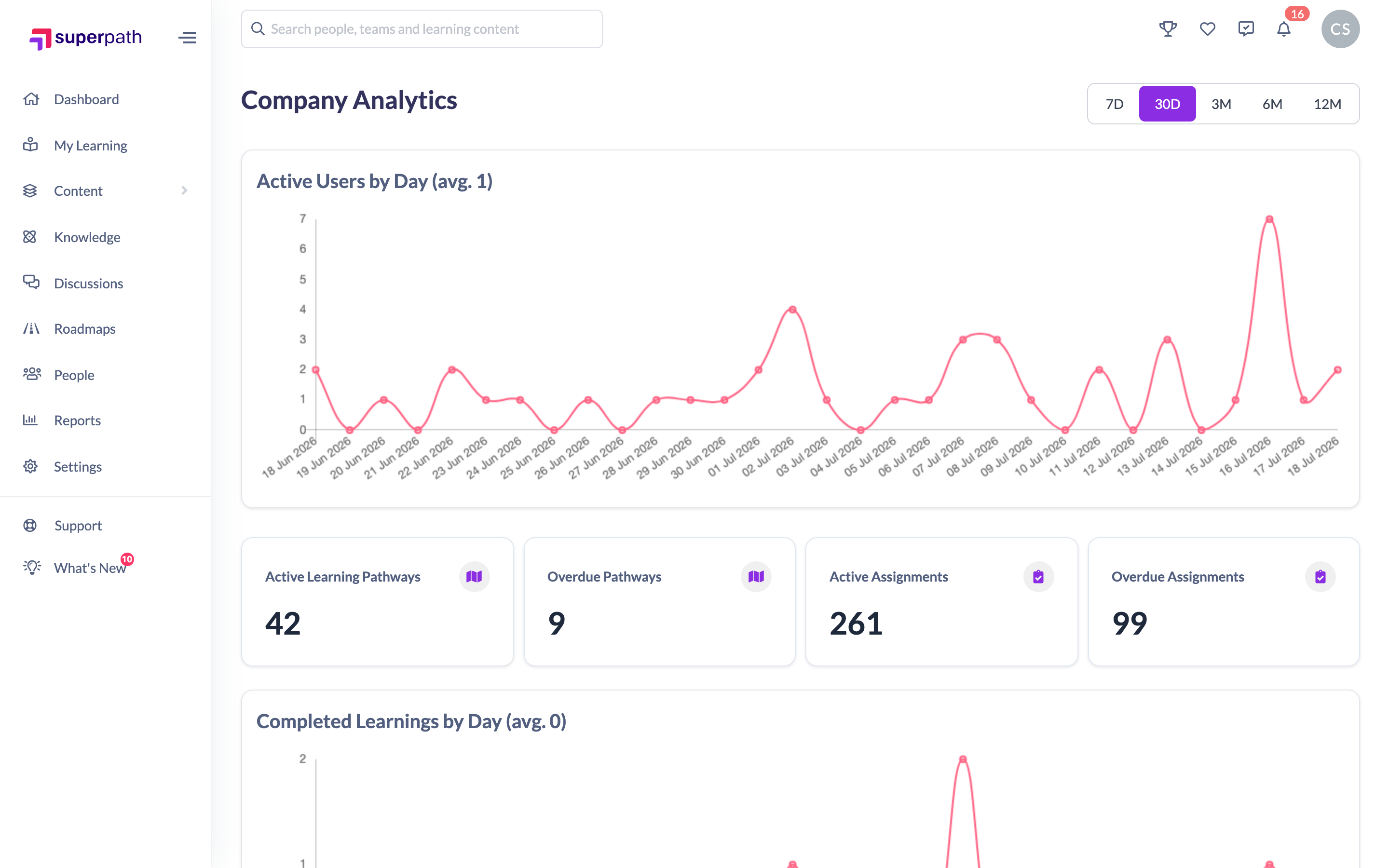
The page is built from charts and summary cards:
- Active Users by Day / Month — a line chart of active users over the selected period, with the average shown in the heading. It switches from a daily to a monthly view automatically when the date range is longer than 30 days.
- Summary cards — headline counts for Active Learning Pathways, Overdue Pathways, Active Assignments and Overdue Assignments.
- Completed Learnings by Day / Month — a line chart of completions over the selected period, again with the average in the heading.

If your platform also has Discussions enabled, a Discussions section appears further down the page with its own charts — see the separate How to View Discussion Analytics article.
Changing the date range
Use the segmented control at the top right to switch the period the time-based charts cover: 7D, 30D, 3M, 6M or 12M. The page defaults to 30D. Changing the range reloads the Active Users and Completed Learnings charts (and the Discussions trend chart, if shown). The summary cards are current counts and are not affected by the date range.
Things to keep in mind
- Company Analytics is read-only — there is nothing to save or configure here, and the charts can't be exported. For exportable tables, use the Reports area.
- The time-based charts group by day for ranges up to 30 days and by month for longer ranges.
- The summary cards (Pathways and assignments) show live counts and don't change when you change the date range.
FAQs
What's the difference between Analytics and Reports?
Analytics is a read-only set of charts for spotting trends at a glance. Reports are tabular — you can filter, save and export them. They live in different areas of the platform.
Can I export the analytics charts?
No. Company Analytics is visual-only. If you need the underlying data in a file, run the relevant report from the Reports area instead.
Why did my chart switch from daily to monthly?
The Active Users and Completed Learnings charts group by day for date ranges up to 30 days and switch to a monthly view for anything longer.
Who can do this
The Company Analytics page has no permission gate of its own, so who can reach it comes down to the links that lead there. The Company Analytics tile on the Reports page is shown only to Owners and Admins. The View Analytics link sits on the Company Dashboard, which Owners, Admins and Managers with direct reports can open. In practice, then, Owners and Admins reach Company Analytics directly, and Managers can follow the link from the Company Dashboard. Content Managers, People Managers, Instructors, Employees and Restricted users have no in-app route to it.
Updated on: 18/07/2026
Thank you!